
TL;DR
We pulled up eight real electrician websites from Minneapolis, Austin, Denver and Phoenix and looked at what each one does to the person who lands on it. The pattern is consistent. The sites that win are not the prettiest ones. They are the ones that answer three questions inside the first screen: are you licensed, will you actually show up, and what happens if I contact you right now.
The best example on this page puts its credentials in a panel beside the headline and promises a firm price before work starts. The weakest one asks for your street address before it will talk to you, then apologizes three times for what its contact form cannot do.
Below: eight sites with honest reactions, the patterns worth copying, the nine pages the trade needs, and what a build like this actually costs in 2026.
Eight electrician websites, reviewed honestly
These are live sites, captured in August 2026 at desktop width. We found them in real search results across four metros rather than pulling from someone else's gallery, so this is what a homeowner actually sees. Every company is linked. None of them are clients of ours.
1. DC Electric, Austin

What it gets right: the strongest homepage in the set. The headline is a promise rather than a description: "A Safer Austin Home, Done Right the First Time." The paragraph underneath commits to a firm price before work starts and to showing up exactly when they say. Beside it sits a panel headed "Don't take our word for it" listing awards, five-star ratings, and Tesla, Eaton and SPAN certifications. Under the buttons, three microproofs: flat-rate pricing, warrantied, always on time.
Why it works: a homeowner choosing between three electricians is trying to reduce risk. This page answers the risk questions before asking for anything. The dual call to action matters too, with booking for people ready to schedule and a visible number for people who want a human.
What we would change: very little above the fold. Momentum drops further down the page, which is common. The hero carries most of the load.
2. Norske Electric, Minneapolis
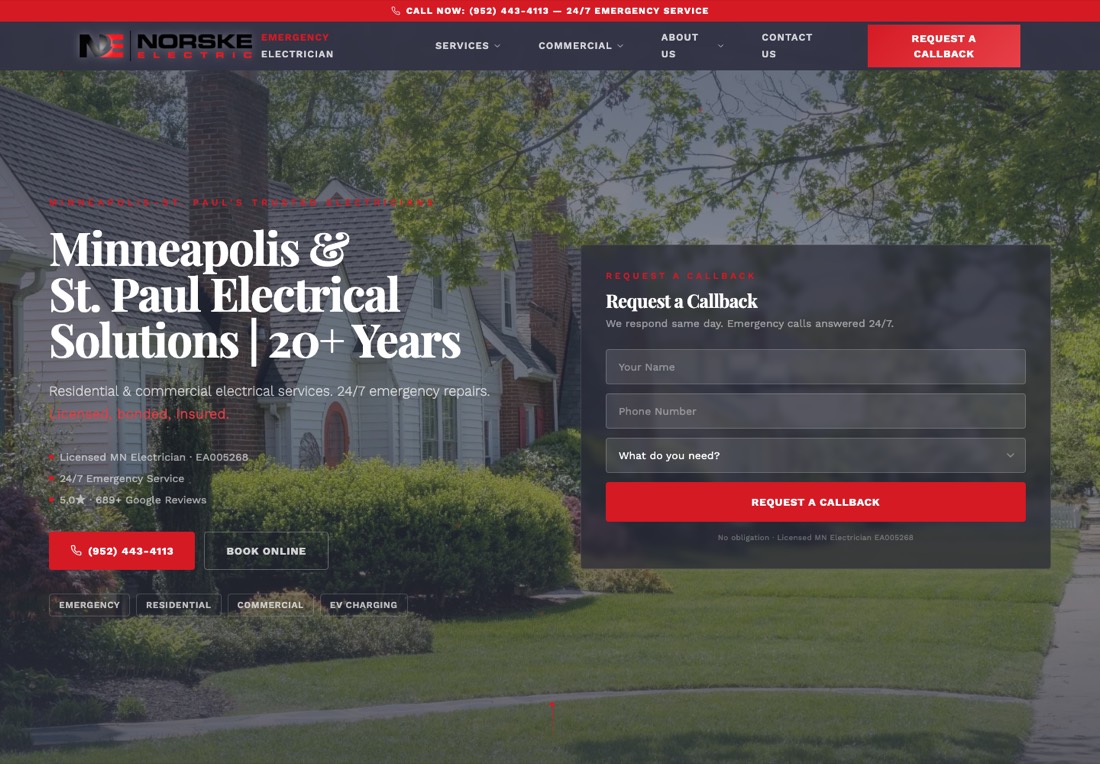
What it gets right: the best lead capture here. A callback form sits in the hero with three fields, name, phone and what you need, plus a line setting expectations: "We respond same day. Emergency calls answered 24/7." The Minnesota license number is printed on the page, the rating is stated as 5.0 across 689 Google reviews, and four chips let someone self-select emergency, residential, commercial or EV charging.
Why it works: three fields is the right number. Every extra field costs completions, and for an electrician all you need is a name, a number and a rough idea of the problem. Publishing the license number is a small thing that does real work in a trade where anyone can claim to be licensed.
What we would change: the "Licensed, bonded, Insured" line is set in red type directly over a photograph and is close to unreadable. Trust copy that cannot be read is not doing its job.
3. SALT Service Co, Austin
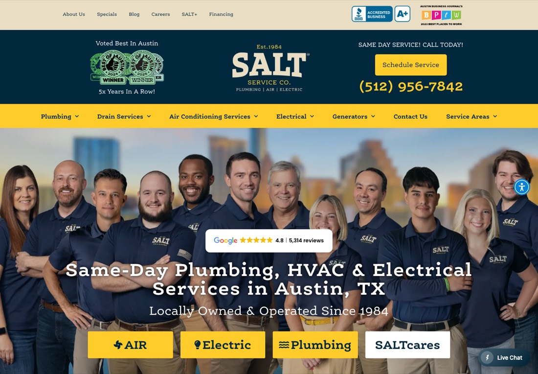
What it gets right: social proof, better than anyone else on this list. A Google badge sits in the middle of the hero showing 4.8 stars from 5,314 reviews, and the background is a real photograph of the actual team rather than stock. Award badges run along the top. Because they sell three trades, color-coded chips split air, electric and plumbing immediately.
Why it works: five thousand reviews is a number that ends the comparison. Putting it in the hero rather than in a testimonials section three screens down is the correct call. The team photo does something stock photography cannot: it says these are the people who will be in your house.
What we would change: the top is crowded, with an awards row, a second header, then a navigation bar before any content. A multi-trade company can carry that. A single-trade electrician should not copy the density.
4. TruTec Electric, Austin
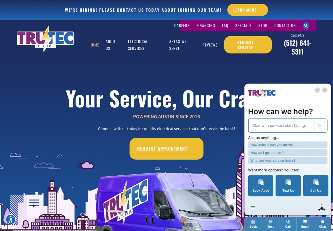
What it gets right: genuine brand personality. The purple van, the Austin skyline illustration, "Powering Austin Since 2016." In a trade where most sites look interchangeable, being recognizable has real value. The bottom bar offers book, text, call, email and chat, a serious attempt to meet people where they are.
What we would change: the chat widget opens on arrival and covers the headline, so the first thing a visitor reads is "Your Service, Our Cra" with the rest hidden behind a chat box. Chat can earn its place, but not by launching on top of the value proposition. Delay it, or trigger on exit intent.
5. Piper Electric, Denver
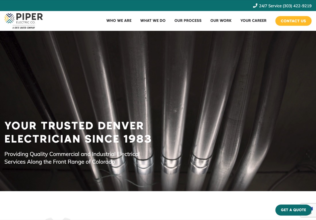
What it gets right: the best photograph on this page by a distance. A full-bleed shot of clean conduit runs, which signals craftsmanship instantly to anyone who knows what they are looking at. "Your Trusted Denver Electrician Since 1983" earns its authority honestly.
What we would change: this is a commercial and industrial contractor and the site is built for that buyer, which is legitimate. But there is no form, no reviews and no pricing signal in the first screen, and the only action is "Contact Us." Long commercial sales cycles survive that. A residential electrician copying this layout loses the homeowner who wants a number in thirty seconds.
6. Schlemmer Electric, Minneapolis
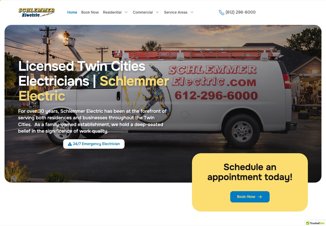
What it gets right: the fundamentals are all present. Branded van in the hero, phone number in the header, a 24/7 emergency link, a booking card, thirty years of history stated plainly.
What we would change: the body copy. "As a family-owned establishment, we hold a deep-seated belief in the significance of work quality" could belong to any business in any trade in any city. Set that beside DC Electric's "gives you a firm price before we start." One is a claim, the other is a commitment. Trading generic copy for specific promises is the cheapest conversion improvement available to most contractor sites.
7. Nordeast Electric, Minneapolis
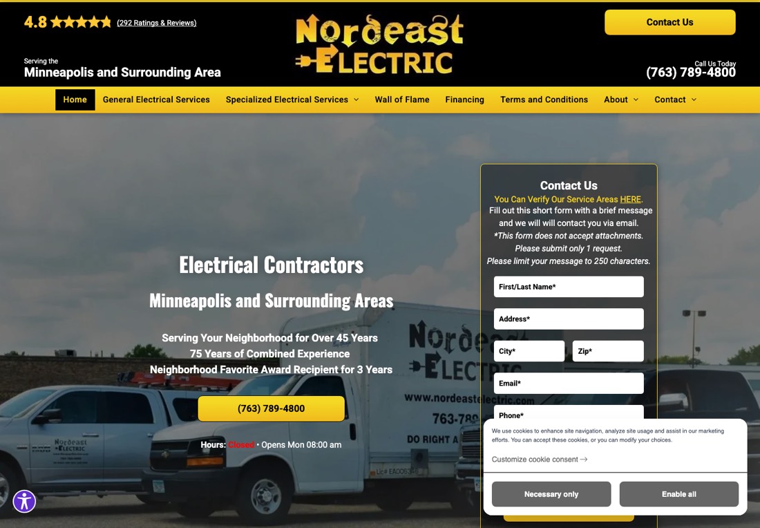
What it gets right: strong, prominent credentials. 4.8 stars across 292 reviews at the very top, 45 years of service, a neighborhood award, and the license number visible on the van.
What we would change: the contact form, which is the clearest lesson on this page. Before you can send a message it tells you the form does not accept attachments, asks you to submit only one request, and limits you to 250 characters. It requires your street address, city and zip before you have spoken to anyone. A cookie banner covers the submit button. Above it, hours read "Closed."
Every one of those restrictions exists to make the office's day easier, and every one costs leads. A form is a door, not an intake system.
8. Livewire Electrician, Phoenix
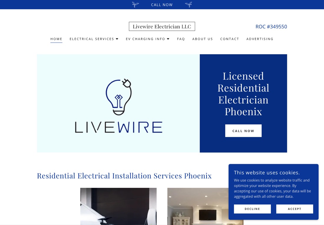
What it gets right: the Arizona ROC license number sits in the header, exactly where a licensed trade should put it, and the site is clean and quick.
What we would change: this is the entry level of the market and it belongs here honestly. The logo takes up half the hero, space that could be selling. There is no rating and no review count anywhere, no form, and the only action is "Call Now" fighting a cookie banner. For a solo operator starting out this beats no website at all. It stops being enough the moment a competitor with a callback form appears in the same results.
Want yours reviewed the same way?
A free website audit is a 10-minute recording of your site through a homeowner's eyes, plus a written report inside 48 hours. If the site is fine, we will say so.
The patterns worth copying
Across the eight, the same handful of decisions separate sites that convert from sites that merely exist.
- Credentials in the first screen. License number, review count, years in business. The two strongest sites here do all three; the weakest bury them or leave them out.
- A promise, not a description. "A firm price before we start" beats "committed to quality" every time, because one can be checked and the other cannot.
- Three form fields, not seven. Name, phone, problem. Address, preferred contact method and how you heard about us can wait until a human is on the line.
- Two ways to act. A form for people who want it handled, a visible number for people who want to talk now. Emergency electrical work skews hard to the phone.
- Real photographs. Your team, your vans, your panel work. Stock photos of anonymous smiling electricians are invisible because every competitor uses the same ones.
- Nothing covering the value proposition. Chat widgets and cookie banners obscuring the headline are the most common self-inflicted wound in this set.
The thing none of these eight do. Not one gives a homeowner a price range before they hand over their details. In a trade where the first question is always "what will this cost," an instant estimate tool that returns a real ballpark in thirty seconds is the biggest differentiator still sitting unclaimed. See what happened when one contractor added one.
The nine pages an electrician website needs
Homepage aside, the structure that ranks and converts is consistent across the trade:
- A page per service: panel upgrades, EV charger installation, rewiring, generators, lighting, troubleshooting
- A page per city you actually serve, with real local content rather than a find-and-replace of the town name
- An emergency page, because that search happens at 9pm and carries different intent
- A financing page if you offer it, since panel upgrades and generators are large tickets
- An about page with real faces and the license number
- A reviews page fed from Google rather than hand-picked quotes
- A contact page carrying a form, a number, opening hours and the service radius stated plainly
Service and city pages are what make an electrician site rank. The full structure is in electrician SEO, the promotion stack in our electrician marketing guide, and the lead side in how to get more electrician leads.
What an electrician website actually costs in 2026
Nobody else ranking for this topic publishes numbers, so here they are.
- DIY on a builder (Wix, Squarespace, GoDaddy): $0 to $300 up front, $20 to $40 a month. Livewire above is roughly this tier. Fine to start with, no conversion tooling.
- Freelancer or quick template build: $1,500 to $4,000. Looks acceptable. Usually ships without service area pages or lead automation.
- Mid-tier custom build: $5,000 to $12,000. Where most established electricians should land.
- High-end custom with field service integration: $15,000 to $30,000.
- Rented from a marketing platform: $250 to $600 a month, and you do not own it. Read the terms before signing.
For reference, our own builds are $1,000 for Smart Website Lite, $3,000 for Core and $8,000 for Pro, or $100 to $400 a month on Easy Start with no credit check, and the site is yours outright at the end of the term. Support runs from $350 a month. The full comparison across every build path is in what a contractor website should cost, and the website cost calculator will price your specific case.
If you want the build handled, the electrician-specific version of our service is on the web design for electricians page, and the general one, with the process and the numbers behind it, is web design for contractors.
What to do this week
- Open your homepage on your phone and time how long it takes to find your license number and review count. More than five seconds means fix that first.
- Count the fields on your contact form. Cut it to three.
- Read your hero paragraph aloud. If it could belong to any electrician in any city, rewrite it as a specific promise.
- Load the site on a phone and check that no chat widget or cookie banner covers the headline.
- Add a way for someone to get a price range without talking to you first.
If you would rather have someone else run that list, grab a free website audit and we will send a report back.
Replacing an existing site rather than building from nothing? The pricing and the redirect checklist are in website redesign cost.
Frequently asked questions
What makes a good electrician website?
The first screen should answer three questions: are you licensed, will you show up, and what happens if I contact you now. In practice that means license number and review count visible without scrolling, a specific promise rather than a generic quality claim, and both a short form and a tappable phone number. Everything else is decoration on top of those three.
How much does an electrician website cost?
DIY on a builder runs $0 to $300 plus $20 to $40 a month. A freelancer or quick template build is $1,500 to $4,000. A mid-tier custom build, where most established electricians should land, is $5,000 to $12,000. High-end custom with field service integration runs $15,000 to $30,000. Renting from a marketing platform costs $250 to $600 a month and you do not own the result.
What pages should an electrician website have?
A page for each service you sell (panel upgrades, EV chargers, rewiring, generators, lighting, troubleshooting), a page for each city you serve, a dedicated emergency page, financing if you offer it, an about page with real faces and your license, a reviews page fed from Google, and a contact page with hours and service radius.
Do electricians need a website if they have a Google Business Profile?
The profile generates the calls and the website closes them. A homeowner who finds you in the map pack clicks through to check whether you look legitimate before dialing. That is the job the site is doing, and it is why credentials in the first screen matter more than design polish.
What is the best website builder for electricians?
Wix and Squarespace are the fastest DIY routes and WordPress with a trade theme is the most flexible, all in the $20 to $40 a month range. None include the conversion tooling that moves the numbers: instant estimates, missed-call text back, call tracking. That is usually why electricians past roughly $500K in revenue move to a custom build.
How long does it take to build an electrician website?
A DIY builder site can be live in a weekend. A freelancer template build usually takes two to four weeks. A mid-tier custom build with service and city pages runs four to eight weeks, most of it content rather than design.
Should an electrician website show prices?
A fixed price for electrical work is usually a mistake because scope varies too much. A range is different, and so is an instant estimate tool that asks a few questions and returns a ballpark. That is the single biggest gap across all eight sites reviewed above. The homeowner will ask about price anyway. Answering first is the advantage.