TL;DR
We pulled five live Minneapolis personal injury law firm websites out of real search results and looked at what each one does to the person who lands on it. Not a gallery of pretty sites. What converts, what leaks, and what we would change.
The pattern is narrower than in most trades. A personal injury visitor is frightened, often in pain, and comparing three firms in three tabs. They are deciding one thing: will these people take my case seriously and what happens if I contact them right now. The sites that win answer that above the fold. The rest lead with their own name.
Two of the five have chat widgets that cover their own headline on load. That is the single most common self-inflicted wound on this page.
Five law firm websites, reviewed honestly
These are live sites captured in August 2026 at desktop width. We found them in real search results for Minneapolis personal injury queries rather than pulling from a best-of list, so this is roughly what a hurt person actually sees. Every firm is named and linked. None of them are clients of ours.
1. Schwebel, Goetz & Sieben
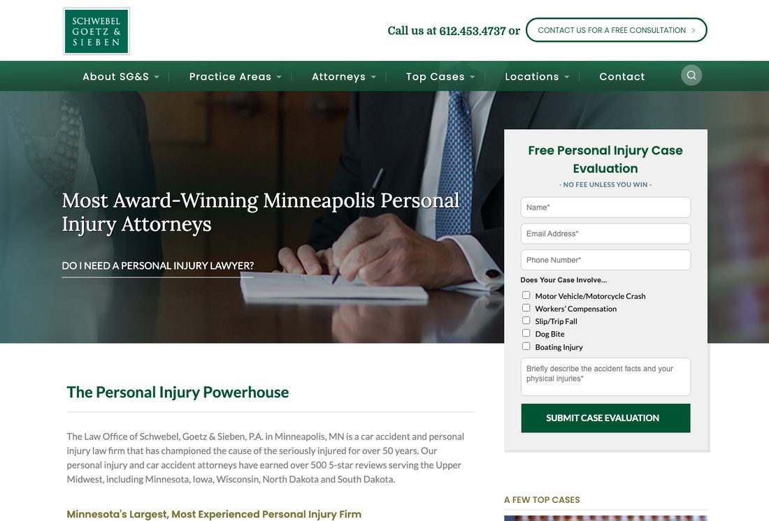
What it gets right: the best intake form in this set. It sits in the hero, and rather than asking for a paragraph it offers checkboxes for the case type: motor vehicle, workers' compensation, slip and fall, dog bite, boating injury. That is smart qualification, because a firm handling five practice areas needs routing more than it needs prose. The phone number is in the top bar with a free consultation link beside it, and "no fee unless you win" sits directly under the form heading where the money question gets answered before it is asked.
Why it works: checkboxes do two jobs. They lower the effort of starting, and they tell the visitor "we handle your specific thing" without a services page. Someone who was bitten by a dog sees dog bite listed and knows they are in the right place.
What we would change: the headline is "Most Award-Winning Minneapolis Personal Injury Attorneys," which is a claim nobody can check and every competitor makes some version of. Further down the page the site says the firm has earned over 500 five-star reviews. That is a real, specific, verifiable number and it is sitting below the fold while an unverifiable superlative occupies the headline. Swap them.
2. Goldenberg Lauricella
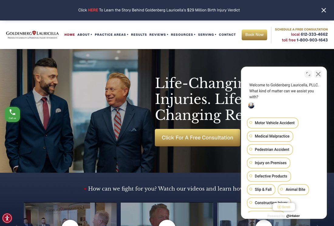
What it gets right: real photographs of the actual attorneys, not stock. In a trade where every competitor uses the same library image of a gavel, two identifiable people in a real office does something stock cannot. The bar across the top promotes a $29 million birth injury verdict, which is exactly the kind of specific proof this audience is scanning for. Both a local and a toll free number are in the header, and there is a "Book Now" button rather than the vaguer "contact us."
What we would change: the chat widget opens by itself on arrival and covers the right half of the hero. The headline reads "Life-Changin... Injuries. Life... Changing Re..." because the widget is sitting on top of the rest. Whatever that sentence says, a first-time visitor does not get to read it. Chat can earn its place on a personal injury site, where people often will not call. It does not earn the right to obscure the value proposition. Delay it ten seconds or trigger it on exit intent.
3. Meshbesher & Spence
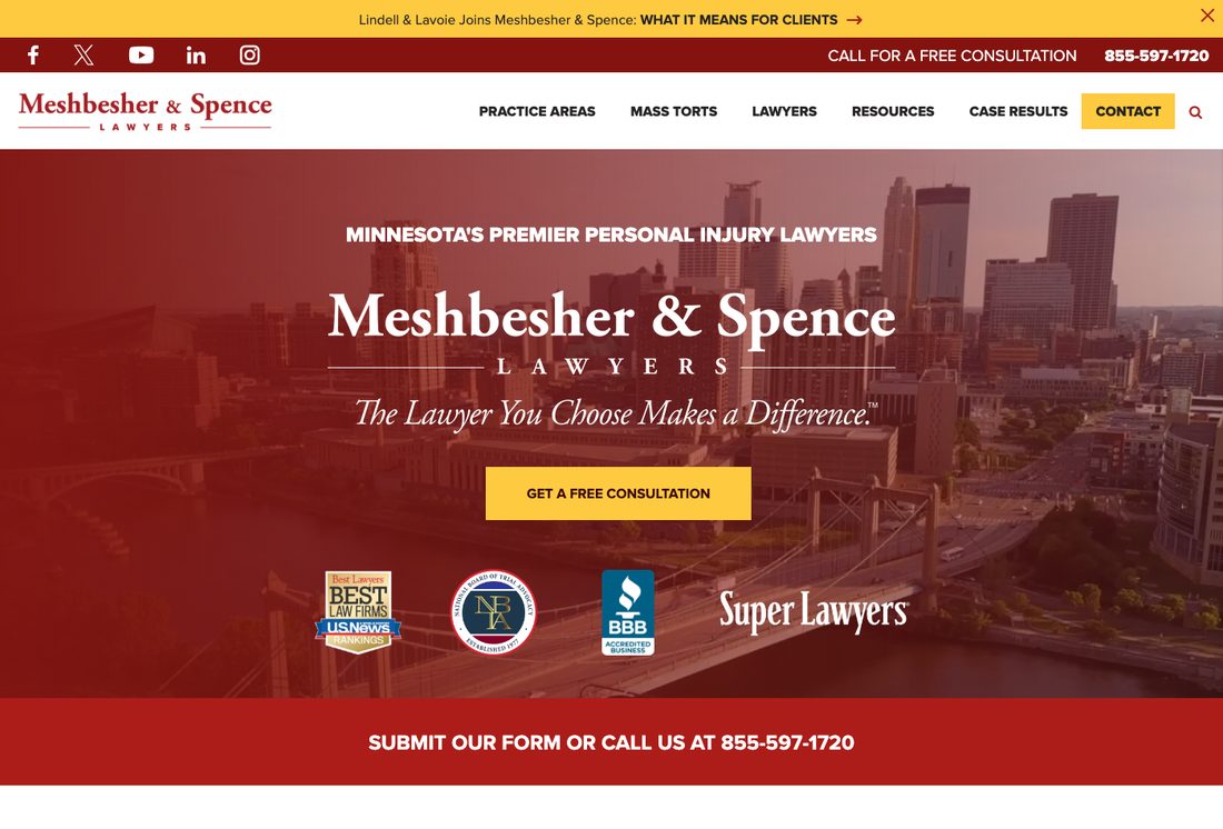
What it gets right: the credential row is the strongest here. Best Law Firms from US News, the National Board of Trial Advocacy, BBB accreditation and Super Lawyers, all sitting directly under the call to action where they back it up rather than being parked on an about page. The phone number appears twice above the fold and again in a red bar immediately below it. A merger announcement runs across the top, which is the right place for firm news.
What we would change: the hero is the firm's own name in large type, with the tagline "The Lawyer You Choose Makes a Difference." It is elegant and it is about them. Compare it to the checkbox form on Schwebel, which is about the visitor's dog bite. A hero has one job on a personal injury site, and it is not brand recall. "Minnesota's Premier Personal Injury Lawyers" above the logo has the same problem as Schwebel's superlative, with the added issue that the skyline photograph behind it could belong to any business in the city.
4. Nicolet Law
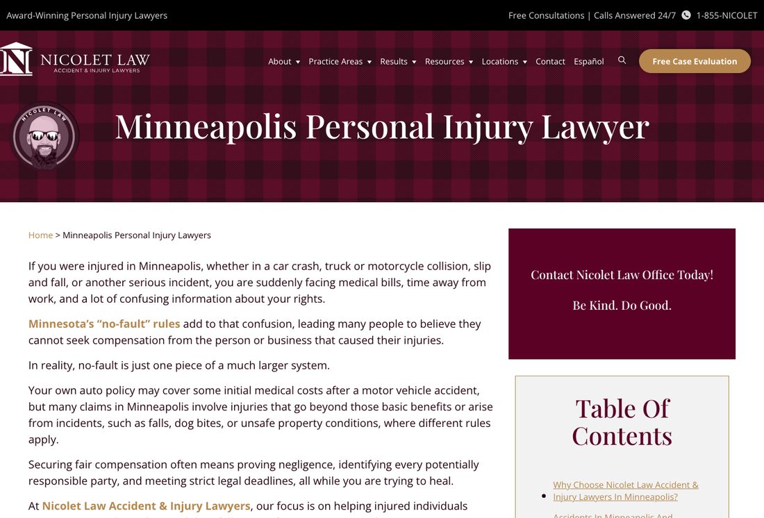
What it gets right: the best content of the five, and it is not close. The page explains Minnesota's no-fault rules in plain language, names the misconception directly, and corrects it. "Calls Answered 24/7" sits in the top bar next to the number, which matters more in this trade than most, because accidents do not happen during office hours. Español is in the main navigation rather than buried. There is a table of contents for a long page.
What we would change: the hero is a title bar. Just the page name over a pattern, no form, no call to action, no proof. Then several hundred words of explanation before the visitor is offered anything to do. The content earns attention and then does not convert it. Put the free case evaluation in that empty band and the page changes character entirely.
5. SiebenCarey
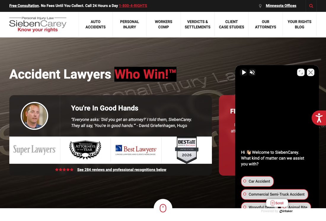
What it gets right: a real client testimonial in the hero, with a photograph and a name and a town: "Everyone asks: 'Did you get an attorney?' I told them, SiebenCarey." That is worth more than any adjective a copywriter could put there. Four credential badges sit beneath it, then a link reading "See 284 reviews and professional recognitions below." A specific review count beats "highly rated" every time. The top bar carries "No Fees Until You Collect" and a 24 hour number.
What we would change: the same problem as Goldenberg, and worse. A chat widget with an autoplaying video panel opens on arrival and covers the free consultation form entirely. You can see the form's red panel behind it with the word "F..." visible and nothing else. The firm has built a good hero and then parked a widget on top of the one element meant to capture the lead.
Two of five sites here cover their own hero with an auto-opening chat widget. We found the identical problem in our review of eight electrician websites, where a chat box hid the headline on arrival. It is not a legal industry issue. It is what happens when a widget is installed with default settings and nobody loads their own homepage as a stranger afterwards.
The patterns worth copying
- Answer the money question above the fold. Four of five say some version of "no fee unless you win" in the top bar or hero. For a person worrying about medical bills, this removes the biggest objection before it forms.
- Route by case type, not by prose. Schwebel's checkboxes and the chat widgets' case-type buttons are doing the same job. A visitor who identifies their situation in one click is qualified and reassured at once.
- Use specific numbers. A $29 million verdict, 284 reviews, 500 five-star reviews, 70,000 cases. Every one of those beats "award-winning," and several firms here own such numbers while leading with the adjective instead.
- Publish a 24/7 answer promise if it is true. Accidents happen at 2am. Two of these firms say so in the top bar.
- Photograph your actual attorneys. Goldenberg and SiebenCarey both show real faces. The others show stock imagery or a skyline.
What to skip
- The unverifiable superlative headline. "Most award-winning," "premier," "best." Every firm says it, which means it carries no information. Your review count does.
- A hero that is your own firm name. Visitors do not arrive knowing or caring about the name. They arrive with a problem.
- Chat that opens on load. If it covers your headline or your form, it is costing you more than it captures.
- Stock photography of gavels, scales and skylines. It is invisible because every competitor uses the same library.
Want this done to your firm's site?
We will record a short walkthrough of your site the way a hurt person sees it, and send you the specific leaks with fixes. Free, and no pitch if the fixes are ones your current developer can handle.
The pages a law firm website actually needs
Beyond the homepage, in rough order of what earns its keep:
- One page per practice area. Car accidents, medical malpractice and workers' compensation are different searches by different people with different fears. One combined services page ranks for none of them.
- Attorney bio pages. People search lawyers by name after a referral, and a bio page is often the first thing they read about you.
- Case results. Numbers, with whatever qualifiers your bar association requires.
- Reviews, on your own site. Not only a link to Google.
- A genuine FAQ. What is my case worth, how long will it take, what does it cost. These are the actual questions and they are also real search queries.
- Location pages, if you mean them. A page per city you truly serve, with substance. Thin duplicated city pages do nothing.
What a law firm website costs in 2026
Honest ranges, including the cheap paths:
- DIY on a builder: $0 to $300 plus $20 to $40 a month. Works for a solo practitioner who needs presence rather than acquisition.
- Freelancer or template build: $2,000 to $6,000. Legal templates are plentiful and mostly look like each other.
- Mid-tier custom: $6,000 to $15,000. Where most established small firms land, with real intake and practice area pages.
- Legal-specialist agency: $15,000 to $50,000 plus monthly retainers that often start around $3,000. The legal marketing vertical is priced well above the trades because case values are higher.
The pricing logic is different from the trades for a reason. A single case can be worth six figures, so firms tolerate acquisition costs that would bankrupt a plumber. That also means the vertical attracts agencies whose pricing assumes you will not compare. Ours is published on the pricing page.
Related reading
- Eight electrician websites reviewed, the same treatment for a different trade
- Seven cleaning websites reviewed, residential and commercial
- What a service business website should cost
- Law firm marketing, how we work with firms
Frequently asked questions
What makes a good law firm website?
An answer to the money question in the first screen, usually "no fee unless you win." A way to start that takes one click rather than a paragraph, such as case-type checkboxes. Specific proof in the form of a review count, verdict figure or case volume rather than the word "award-winning." Real photographs of the attorneys. A phone number that is visible without scrolling.
Should a law firm website have a chat widget?
It can work well, because many injured people will message before they will call. The mistake is letting it open automatically on arrival. Two of the five sites we reviewed have widgets covering their own headline or intake form on load. Delay it, or trigger it on exit intent.
How much does a law firm website cost?
DIY on a builder runs $0 to $300 plus a monthly fee. A freelancer or template build is $2,000 to $6,000. A mid-tier custom build, where most established small firms land, is $6,000 to $15,000. Legal-specialist agencies run $15,000 to $50,000 plus retainers often starting near $3,000 a month.
What pages should a law firm website have?
A separate page for each practice area rather than one combined services page, attorney bios, case results, reviews hosted on your own site, a real FAQ answering what a case is worth and how long it takes, and location pages only for cities you genuinely serve.
Do law firms need separate pages for each practice area?
Yes. Someone searching for a medical malpractice attorney and someone searching after a car crash are different people with different fears and different search terms. A single combined page competes for both and usually ranks for neither.
What should a personal injury hero section say?
What you do, who for, what it costs to start, and one obvious action. The weakest heroes in our review led with the firm's own name or an unverifiable superlative. The strongest offered a case-type selection and a fee promise.
Are stock photos bad for law firm websites?
They are not harmful so much as invisible. Gavels, scales and skylines appear on thousands of legal sites from the same libraries. Photographs of your actual attorneys in your actual office are the cheapest differentiation available.