 ChatGPT
TL;DR
- The landscaping sites that win put a quote button, a phone number and a reason to trust you in the same screen as the headline. The best site on this list does all three and states its review count.
- We pulled the landscaping companies that rank organically for "landscaping company" in Minneapolis, Austin, Denver and Charlotte, and captured ten of their homepages at desktop width on October 20, 2026.
- Landscapers have the best photography of any trade, and photography still did not decide the grades. The pattern matches every other trade we have reviewed.
- The weakest sites hide the headline behind a dark photo, open with a cookie banner, or list their services in thin capital letters nobody can read.
- Below: ten sites reviewed honestly, the pages a landscaping site needs, what the stack choices cost, and what a build like this runs in 2026.
Skill Mammoth builds websites for contractors, landscapers included, so this is a review by a vendor and it says so where that matters. None of the ten companies below are clients.
We found them in live search results rather than in a template gallery. That makes this the competition a landscaper is up against, not a designer's portfolio.
If you want the lawn care version of this review, with mowing-route companies rather than design-build firms (companies that design a project and then build it), it is in the lawn care website design guide.
Ten landscaping websites, reviewed honestly
The order is roughly best to worst for a homeowner who arrived from Google with a project in mind. "Best" here means the site answers the three questions that homeowner has, inside one screen:
- What do you do?
- Can I trust you?
- What happens if I reach out right now?
Design-build landscapers sell five-figure projects, so the first screen, which designers call the hero, can afford to be calm. It cannot afford to be empty.
1. Alex's Lawnscape, Charlotte
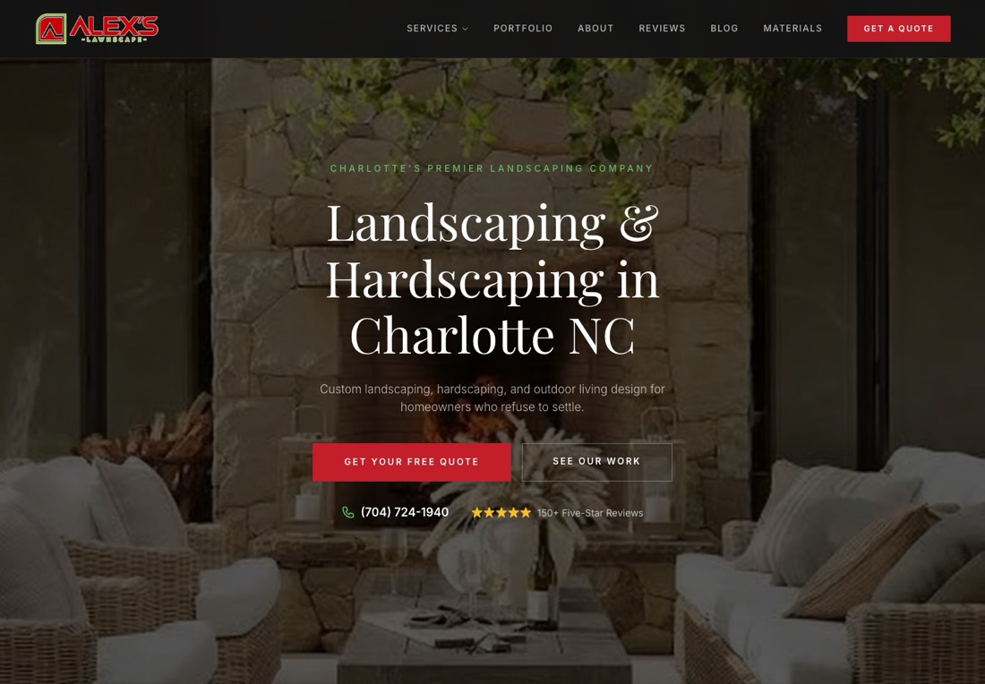
The strongest first screen in the set. A small label reads "Charlotte's premier landscaping company." The headline says exactly what they do and where: "Landscaping and Hardscaping in Charlotte NC." Hardscaping is the stone side of the trade, the patios and walls. The subhead names the customer, "homeowners who refuse to settle."
Under that sit two buttons, a red one for a free quote and an outlined one to see the work. Then come a phone number and a line reading "150+ Five-Star Reviews" beside five stars. The photograph is a patio at dusk with the headline over the dark half, so the text stays readable.
Further down the page a section is headed "Don't Wait Until Spring." It is the first landscaping homepage we have seen that sells the off-season instead of apologizing for it.
What we would change is small. The review count links nowhere in the hero, and a homeowner who wants to check it has to find the Reviews page in the navigation. Put the number on a link to the Google profile. Otherwise this is the layout to copy.
2. Minnesota Landscapes, Twin Cities

The best lead capture here. The headline calls the company a "design-first landscaping contractor," and three bullets underneath name the three things they sell:
- Outdoor living design.
- Patios and retaining walls.
- Trees and softscapes, meaning the planting work.
The bottom of the hero carries a yellow "Get an estimate" button next to the phone number in a white box. The site also has a Locations menu, which is the right structure for a metro with forty suburbs.
The photograph is a crew unloading pavers from a dump truck. That does more for a design-build firm than any finished-patio shot, because it says these people do the work themselves.
Two things to fix. The headline is set in yellow italic capitals over a blue-tinted photo, which reads as a 2015 template. And the copy underneath promises to take your yard "from Underwhelming to Unforgettable." That is a slogan where a sentence about the process would do more. The bones are right.
3. KG Landscape, Minneapolis
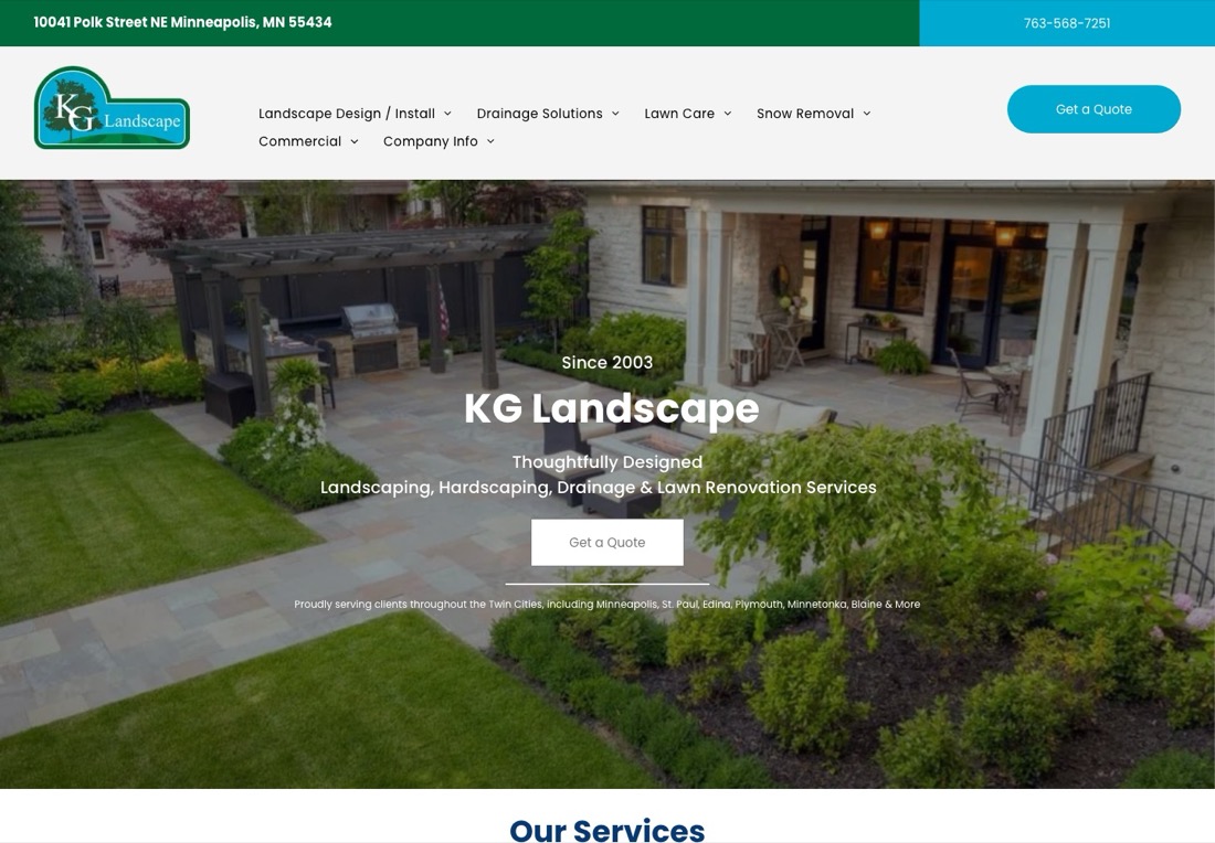
Clean and complete. The address sits in the top bar with the phone number. The hero says "Since 2003," names the four services in one line and offers a quote button.
Under the button a single small line lists the suburbs served, Minneapolis through Blaine. That is a cheap, effective signal to both the homeowner and to Google.
The navigation is organized by what a homeowner wants rather than by company page:
- Design and install
- Drainage
- Lawn care
- Snow removal
- Commercial
Drainage as a top-level menu item is smart in a state where half the landscaping calls start with water in the basement.
The weak point is the quote button, a pale translucent rectangle over the photo that a visitor can miss. Make it solid. And "Thoughtfully designed" is doing the work a specific claim should do. A number, a warranty or a timeline would be stronger.
4. Minnehaha Falls Landscaping, Minneapolis
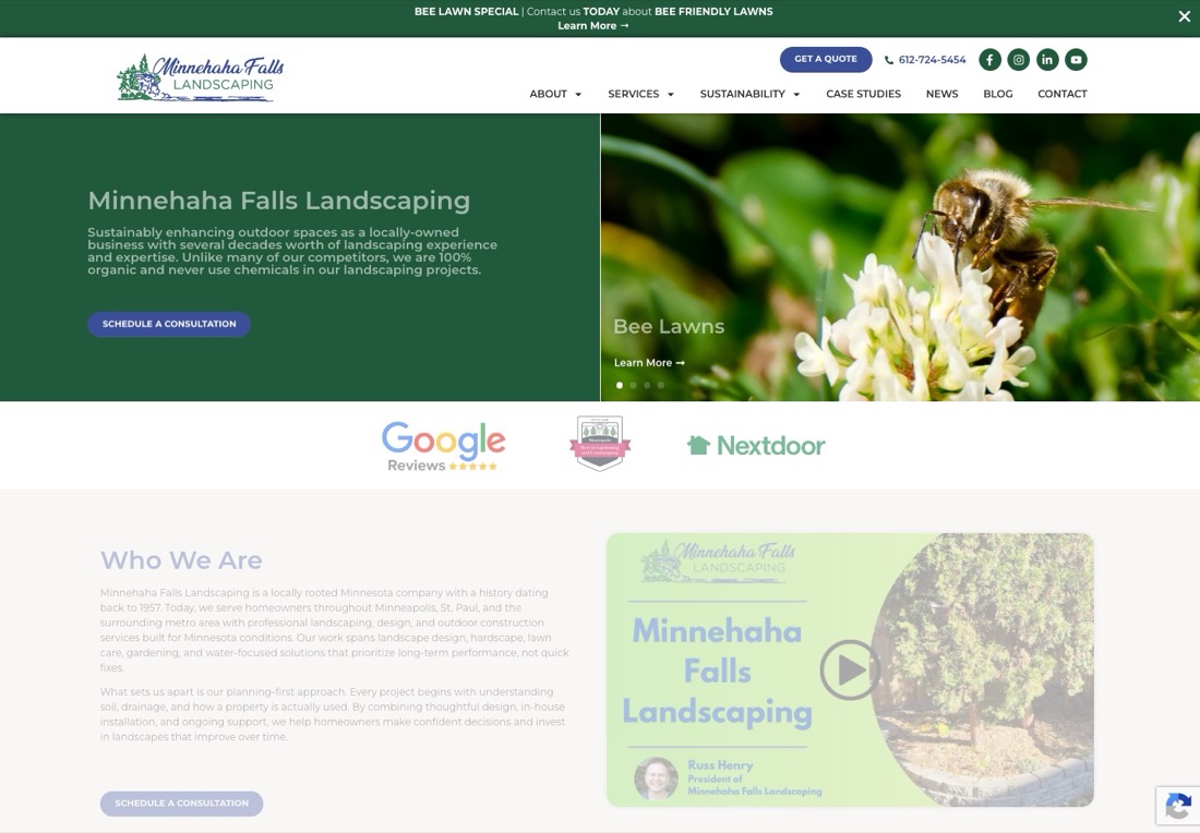
The best trust row in the set, and the most interesting positioning. Directly under the hero sit three badges: Google Reviews with stars, a local association seal and Nextdoor.
The hero copy makes a claim nobody else here makes: "we are 100% organic and never use chemicals." That is a reason to choose them that a homeowner can repeat to a spouse.
A promo bar across the top sells a "Bee Lawn Special." The hero is a slider, meaning a set of rotating slides. Its current slide is about bee lawns, which tells you what they want to sell this season. The company dates to 1957 and says so in the About section.
The first problem is the slider itself, which means the headline a visitor sees depends on when they arrived. The second is a two-column hero where the right half is a photograph of a bee, which pushes the schedule button into the lower left corner.
A fixed hero with the organic claim as the headline and the three badges directly under it would convert better than the carousel.
5. Austin Native Landscaping, Austin
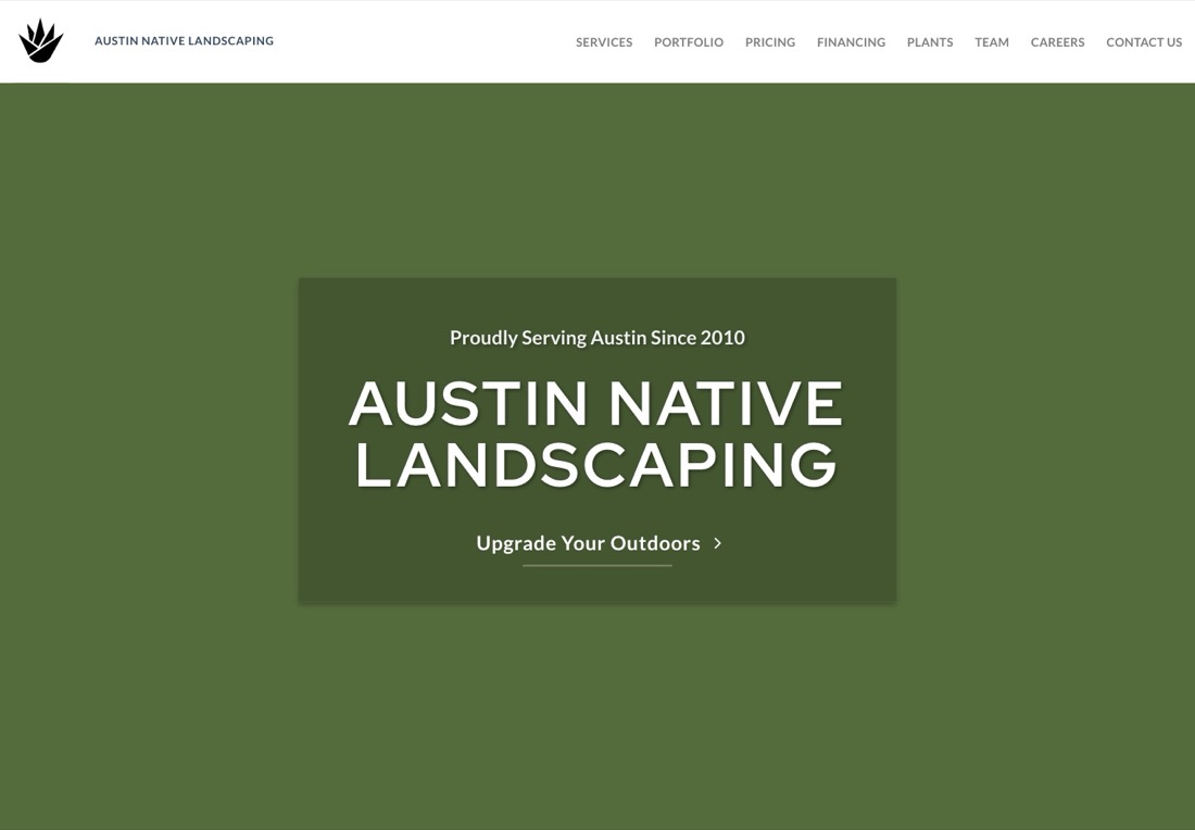
Read the navigation before you judge the hero. It includes Pricing and Financing, and almost no landscaper publishes either. A homeowner who can read a price range and a financing option before calling is a homeowner who calls ready.
The Plants link and the Team page round out the trust story. "Proudly serving Austin since 2010" sits above the name.
The hero itself is the plainest on this page, a flat green block with the company name in capitals and a single text link reading "Upgrade Your Outdoors." Everything else is missing:
- No photograph.
- No phone number.
- No button.
- No services.
For a company with a portfolio and a pricing page, that is a strange choice, and it reads as a loading failure the first time you see it.
Put one project photograph behind the block, add the phone number and a quote button, and this site climbs to the top three on the strength of the pricing page alone.
6. Designs by Sundown, Denver
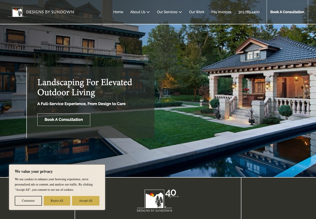
This is the high-end design-build site done properly. The headline, "Landscaping for Elevated Outdoor Living," sits in a translucent panel over a photograph of a stone house with a pool.
The subhead promises "a full-service experience, from design to care," and a single outlined button books a consultation. "Celebrating 40 Years" is the next section.
The navigation includes "Pay Invoices." That is the kind of detail a firm with recurring maintenance clients needs and most sites bury.
And then a cookie banner covers the bottom third of the hero, asking the visitor to customize, reject or accept before they have read a word. A Denver landscaper does not need a consent dialog that would satisfy a German regulator. Remove it, or at least make it a thin bar.
The photograph also sells a budget most homeowners do not have, which is fine if that is the only customer you want.
7. Southern Love Landscaping, Austin and Cedar Park
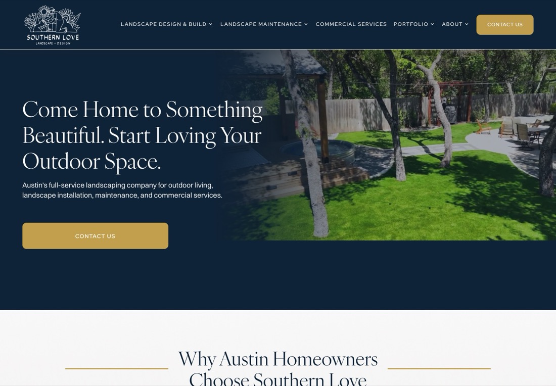
A Squarespace site that looks better than most custom builds. A navy panel carries a serif headline, "Come Home to Something Beautiful. Start Loving Your Outdoor Space." The subhead names all four lines of business, and a gold button says Contact Us.
The next section is headed "Why Austin Homeowners Choose Southern Love." Then comes a line that starts "Most Homeowners Aren't Frustrated With Landscaping," which is a good hook for the objection-handling copy that follows.
What is missing is any number. None of these appear in the hero:
- A phone number.
- A review count.
- Years in business.
- A project count.
The one button reads "Contact Us," which is the weakest verb available. "Get a quote" or "Book a site visit" sets an expectation.
The Squarespace choice is not the problem, and the CMS guide explains why the platform, the content management system you edit the site in, matters less than owners think. The empty hero is.
8. Dean Bjorkstrand, Minneapolis and St. Paul
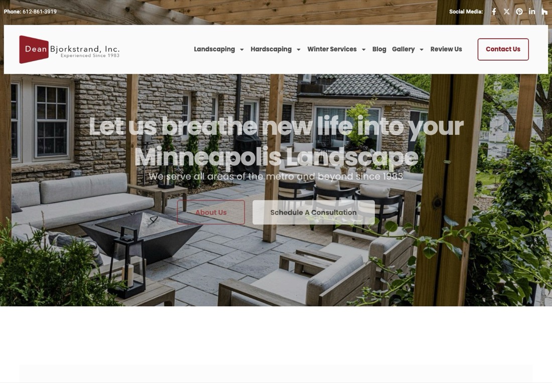
Good content under a hero that fights itself. The navigation is organized by season: landscaping, hardscaping and winter services. The company says "since 1983" in the subhead.
There are two buttons, one to learn about the company and one to schedule a consultation. The projects section is titled "Projects of Note." The Review Us link in the main navigation is a nice touch for a firm that has been around long enough to have a review habit.
The headline, "Let us breathe new life into your Minneapolis landscape," is set in white over a photograph of a bright stone patio and white furniture. About a third of the letters disappear into the background.
A homeowner should never have to squint at the first sentence. Darken the photo, put the text in a panel or move it onto the shaded half. The Schedule button is fine, and the phone number in the top bar is small but present.
9. C&H Landscaping, Denver
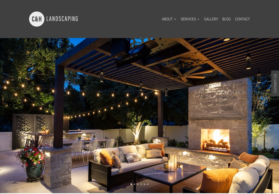
The best photograph on this page: a pergola at dusk with string lights, a stone fireplace and an outdoor kitchen, filling the entire first screen. Anyone who wants that backyard knows these people can build it.
The headline lives below the fold, the part of the page you only see after scrolling. It is a textbook local SEO line, written to rank for the service and the city: "Custom Landscaping Company in Denver, CO, for Outdoor Living Design."
The services section is split sensibly into design and estimating, then construction and hardscaping, then maintenance.
The first screen is a different story. It has none of these:
- A headline.
- A button.
- A phone number.
- A form.
The only call to action is a vertical "Contact Us" tab on the right edge. A homeowner on a phone sees a beautiful picture and nothing to do.
Even one line of text and one button over the lower left of that photo would turn the best image on the list into the best hero on the list.
10. The Whole Blooming Landscape, Charlotte
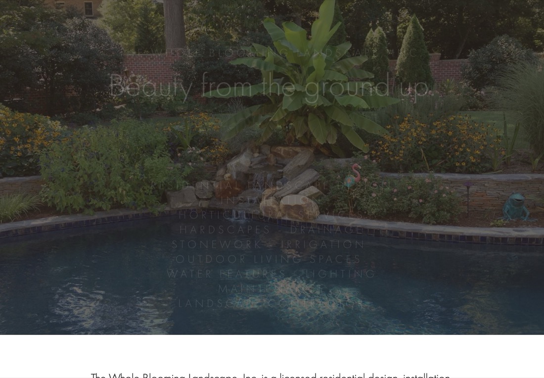
A licensed design, installation and maintenance company. Its Google result carries sitelinks, the extra page links under a listing, for a gallery, before-and-afters and testimonials. That means the content exists.
The photograph, a pool with a banana plant and black-eyed Susans, is a real project and a good one.
The hero lays "Beauty from the ground up" and a twelve-line list of services in thin white capital letters over the dark photo, and almost none of it can be read. There is no button, no phone number and no headline in the normal sense.
The company's own description does not appear until the second screen.
This is the site on the list that would gain the most from a rebuild, and the rebuild would not need new photography. It needs a readable headline, a quote button and the review page promoted to the top of the page.
What the winners share
Across the ten, four things separated the top of the list from the bottom.
| Element | Sites that have it in the first screen | Why it matters |
|---|---|---|
| A readable headline that names the service and the city | Alex's, Minnesota Landscapes, KG, Southern Love, Sundown | Visitors confirm the right place without scrolling; Google reads it too |
| A quote or estimate button with a specific verb | Alex's, Minnesota Landscapes, KG, Minnehaha, Sundown | "Get a quote" says what happens next |
| A phone number in the hero | Alex's, Minnesota Landscapes | Half of traffic is mobile; tap-to-call books site visits |
| A trust number: reviews, years, projects | Alex's (150+ reviews), KG, Minnehaha, Sundown (40 years), Bjorkstrand | A five-figure purchase; a number ends the comparison |
| Verdict | Two of ten have all four; both rank page one. | |
"Get a quote" converts better than "Contact us" because it tells the visitor what happens next. Half of landscaping traffic is on a phone, so a tap-to-call number is the shortest path to a booked site visit.
On trust numbers, KG has been around since 2003 and Bjorkstrand since 1983, and Minnehaha shows its founding year, 1957, next to its badges. The two sites with all four elements rank on page one in their metro, yet neither has the best photography on the list. Copy the structure before you reshoot the portfolio.
Want to know which of the four your site is missing?
Fifteen minutes on your homepage, your service pages and where you rank for the projects you want. We will tell you what to fix first, including when the answer is nothing.
The pages a landscaping website needs
Every site above has a homepage and a gallery. The ones that rank for more than their own name have the rest of this list, and the ones that get the most calls have the first three.
- A service page for each line of business you want to sell. One page per service, with its own photos and its own price range. The landscaping SEO guide covers how these pages rank. The lines to cover:
- Landscape design
- Patios and hardscape
- Retaining walls
- Planting and softscape
- Drainage
- Lawn care
- Irrigation
- Snow removal
- A project page for each notable job. Put the city in the title, with five to ten photos and two sentences about the problem the homeowner had. These are the pages that win "paver patio Edina" searches and the pages a homeowner sends to a spouse.
- A reviews page that pulls from Google. Put the count in the hero as well.
- A pricing or "what it costs" page. Ranges are enough. Austin Native is the only site on this list that has one, and it is the reason to call them.
- City or area pages for the suburbs you drive to. Use real projects from each, not the same paragraph with the town name swapped.
- An about page. Include the owner's name and face, the year founded and licenses. Design-build is a relationship purchase and the homeowner wants to know who is coming over.
- A financing page if you offer it. Most firms selling $20,000 patios should.
- A contact page. Use a form that asks for the address and the project type, nothing else, and a line that says when you will respond.
Stack, and what it costs
Of the ten sites, six are WordPress, two of them built with Divi, a WordPress page-building theme. Two are Squarespace and two we could not identify.
The platform did not predict the ranking. Alex's Lawnscape, the best site here, runs on a stack we could not fingerprint, meaning we could not identify it from the code. Southern Love, one of the better-looking ones, is Squarespace.
What predicted the ranking was whether the first screen had a headline, a button and a number.
What a landscaping site costs in 2026 depends on who builds it and how many pages it has. Our own prices are in the table so you can benchmark them against the agencies and the do-it-yourself platforms.
| Who builds it | Build | Monthly |
|---|---|---|
| You, on Squarespace or Wix | Your weekends | $16 to $50 |
| Skill Mammoth Smart Website, with service, project and city pages | $3,000 one time, or $150 a month for 24 months | Care plans from $350, on any host |
| Agency that specializes in the green industry, comparable build | $5,000 to $15,000 quoted | $100 to $500 to host it |
The one-time build leaves the code owned by you. Easy Start, our payment plan, spreads the same build over 24 months.
For the agency side, the lawn care marketing agencies list has the published numbers where they exist.
The do-it-yourself route works, and the sites above show it can rank. It will not have the project-page system or the city pages that separate the top of this list from the bottom. That is what you are paying for when you pay more.
What to do with your own site this winter
Landscaping demand bottoms in December and January and the calls start in March. That is why the landscaping marketing guide puts "project pages and portfolio" on the November to-do list.
The site changes that move the needle take a weekend, not a quarter:
- Rewrite the headline. Make it name the service and the city.
- Add the phone number and a quote button to the hero. Give the button a specific verb, such as "Get a quote."
- Put your review count or your founding year under them. A number ends the comparison faster than an adjective.
- Build one project page a week. Use the photos already on your phone, and by March you will have a dozen pages that rank for the patios and walls you want to build.
If the site cannot do that without a developer, that is the signal it is time to replace it. The lawn care leads guide covers where those pages fit in the rest of the lead system.
Frequently asked questions
What makes a good landscaping website?
A first screen that names the service and the city, offers a quote button and a phone number, and shows a trust number such as a review count or years in business. After that, a page for every service, a page for every notable project, and real photographs of your own work. Of the ten sites reviewed here, the two that have all of it rank on page one in their metro.
How much does a landscaping website cost in 2026?
From $16 to $50 a month on Squarespace or Wix if you build it yourself, $3,000 one time (or $150 a month on Easy Start) from a contractor-focused builder like us, and $5,000 to $15,000 from a green-industry agency. The difference at the top end is service pages, project pages and city pages, which are the pages that rank.
Should a landscaping website show prices?
Yes, as ranges. Only one of the ten sites reviewed publishes a pricing page, and it is the strongest reason to call that company. A homeowner who has seen "paver patios typically run $8,000 to $20,000" calls ready to buy rather than ready to be surprised.
Is WordPress or Squarespace better for a landscaping company?
Neither predicted ranking in this review. Six of the ten sites are WordPress, two are Squarespace, and the best and worst sites were on different platforms. Pick the one you can update yourself, then spend the effort on the headline, the quote button and the project pages.
What pages should a landscaping website have?
Home, a page per service, a page per notable project, reviews, pricing, about with the owner's name, city pages for the suburbs you serve, financing if you offer it, and a short contact form that asks for the address and the project type.
Do landscapers need a photo gallery?
You need the photos, but a single gallery page is the weakest way to use them. Put the photos on project pages with a city in the title and a sentence about the job, and each page can rank for a search a gallery never will.
See how your site compares to the ten above, free.
Send us your website. The 10-minute audit grades your first screen, your service pages and your rankings against the landscapers in your metro, within 48 hours.